Shades of Perry

Here are two more 8″x10″ acrylic paintings of Perry. The first was a thank-you gift for a coworker, and it’s Perry as his number one fan. This painting was unique in that it’s one of the few where the design wraps around the edges of the painting as well. (As opposed to a solid colored background.) Unfortunately, those pictures were blurry, so I’ll have to sneak into his office to take more. Yes, it’s hanging in his office! 🙂

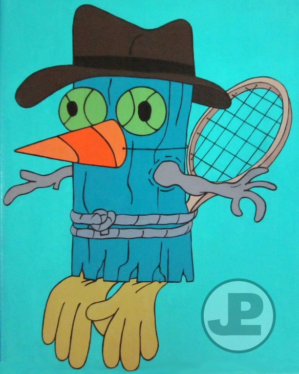
The second is Perry the Practicepus, a gift for another coworker who is endlessly entertained by Dr. Doofenshmirtz having a practice dummy of Perry made from a painted log, tennis racket and tennis balls, rubber gloves, twigs, and an orange cone tied around its head with a piece of string. This, too, is hanging up in the office. Makes me proud 🙂

Birthday Paintings

Below are two paintings I made for birthdays. The first was for a dear friend of mine, and the second was commissioned by another friend for his husband. He actually did the design, I just transcribed it in paint. 😉

Both are acrylics on 8×10″ canvas. (And I’ve included the evolution photos of Donald. And please pardon the glare on Mickey.)

So, I’ve been painting…

I’ve been painting a lot lately, but it’s left me with little time to talk about the painting I’m doing. I’ve done some more Phineas and Ferb characters, and even a few commissioned pieces. (Thanks to those of you who saw my autographed paintings and inquired about getting one of your own. It was quite touching, and humbling!)

Below are my latest pieces. I know I promised crafting diversity on this blog, and more of it will come, but when I’m in a phase, there’s no telling how long it’ll last. Don’t even get me started on all the Pinterest projects I’ve logged away and have been waiting to make. Acrylics are just ruling these days!

Below is “Something that doesn’t exist” and Bobblehead Perry from Phineas and Ferb. They’re both 8×10″ canvases.

I have been taking more progress pictures though. You can see how many tries it takes for me to settle on a shade of green for Swampy 😉 Me, a perfectionist? Nonsense.

Swampy, if you don’t recognize him, is the star of the highly addictive game “Where’s My Water?” Don’t say I didn’t warn you. He was commissioned by someone who saw my other paintings and wanted one of his own. I was thrilled to make it! (He, too, is on an 8×10″ canvas.)

I’ll post some more later on!

Anything but clothing…

I went to a cleverly themed party the other night called an ‘Anything But Clothing’ party. Now, many of you may have heard of these, but apparently I missed out on a lot in college. The premise of the party is like a costume party – but you make your outfit from something that can’t be considered clothing. The examples the host gave were a friend of his who once made a skirt out of gatorade labels, and the ever classic duct tape outfits.

I was excited for the challenge, and had a bunch of ideas. Of course, I had to can a few of them for logistical reasons (too hot, too noisy, too restrictive), but I came up with the idea to make an outfit out of shopping bags. I have a ton of paper bags from various stores, and though the details were sketchy when I started, I had an image of a nice long skirt (and I don’t care what anyone said, I was wearing real clothes underneath…), and the top was TBD.

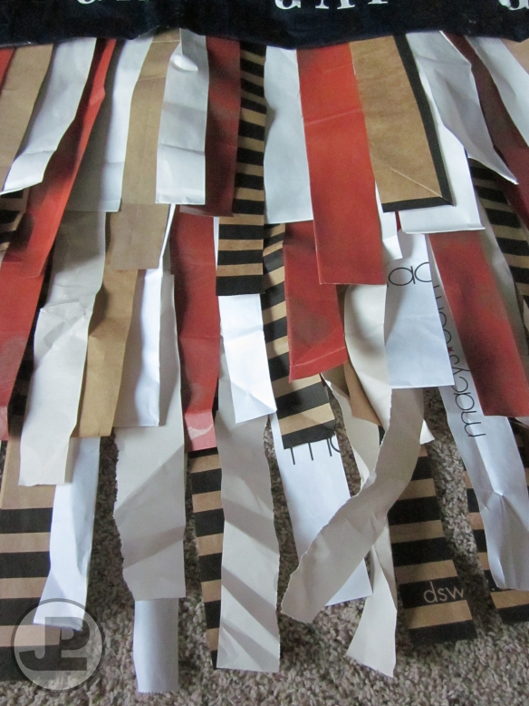
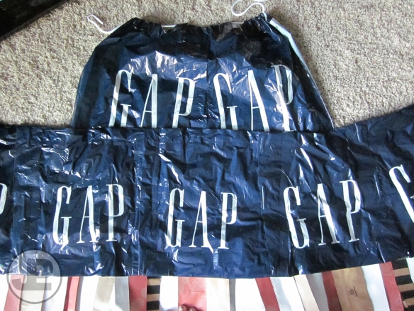
To fashion the skirt, I took a long piece of duct tape, and started sticking strips from the shopping bags on them starting from the same top line. I made three layers, and taped them all together for maximum coverage. For the top, I was inspired by the multitudes of Gap shopping bags I had lying around (I didn’t realize I was seemingly collecting them), and the idea for a halter top using the drawstring from one of the bags. I didn’t measure anything, I just tried to make it long enough that it would cover me and fit over the skirt.

So, yeah! I think it came out pretty cute! (It was also incredibly hot and sticky under the duct taped parts and the plastic top, but I saw that coming. That’s why you get the picture early on in the evening!)

Have you designed any super creative costumes from stuff rather than fabric? I’d love to hear about it!

Painting Update

So I’ve done some new paintings recently of Phineas and Ferb characters, but haven’t posted any of them… Yesterday, however, I had the thrill of a lifetime.

Backstory (which is appropriate if you’ve ever seen the show):

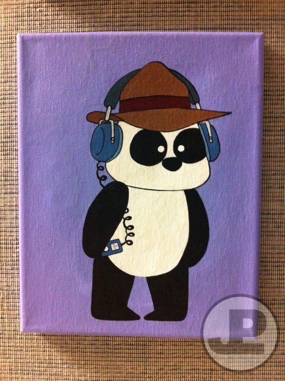
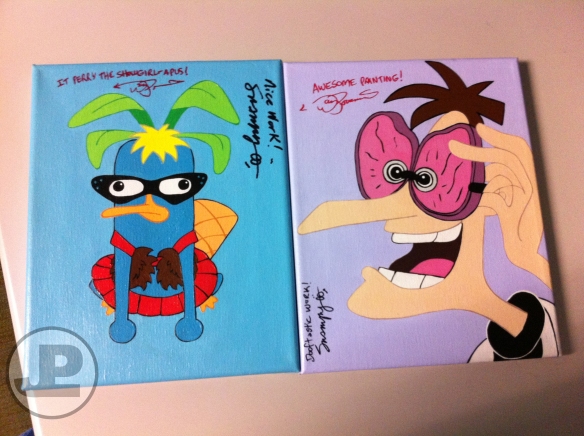
The two most recent paintings I did were of Dr. Heinz Doofenshmirtz wearing Steak Specs, and Peter the Panda rocking out to some PFT. Both are done with Acrylic on 8×10″ canvas. For some reason, I can’t find a picture of Doof. (I’ll work on it, and post it later.)

I went to Starbucks with a coworker for an afternoon pick-me-up, as per usual, and when I got back to my desk, two of my paintings were gone. I was a bit freaked out, as paintings don’t sprout legs when they feel like running off, and no one had left a note saying they were taking them. No one had seen anything, of course, so I sort of felt like a crazy person.

A bit later, I was heading back to my cubicle from my boss’ office, and there they were, miraculously replaced on their appropriate pegs. Only, there was something different…

My coworkers heard me exclaim something along the lines of, “NO WAY! HOLY CRAP!” and came running to see what was going on, with big smiles on their faces. Apparently everyone was in on it, this elaborate ruse.

A coworker in another department, who had often stopped by to see if I’d updated my painting collection, had taken them with him to a meeting with Dan and Swampy – the creators of Phineas and Ferb. Not only that, but he told me that were “blown away” by my paintings. He had asked them to sign these, and said they were hesitant because they didn’t want to ruin my artwork, or to have people think someone else painted them. (Which I understand.)

I couldn’t get over it. He and my boss asked me, afterwards, if I was happy with the surprise. AB-SO-LUTE-LY! I think it’s awesome to have someone, whose work you idolize, comment that your work is Dooftastic. And I thought it was pretty funny that it was on my artwork. If they weren’t one of a kind before…

Let’s just hope these don’t up and run away!

Perry and Meap

I’ve actually done a bit of painting lately, and it seems I found my newest inspiration in the Disney Channel show Phineas & Ferb. It’s a great cartoon, if you’re into wacky adventures, awesome musical numbers, and humor that’s silly for kids but with enough layers for an adult to enjoy as well. I am, on all counts.

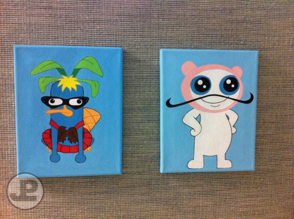
Recently, I made these paintings for my cubicle. The first is of Perry, the boys’ pet platypus, after he’s been dressed up by the boys (Phineas and Ferb) to be in their Cirque (circus) act. Perry is also leading a double life as a secret agent, and the boys don’t know about it. He’s been painted in acrylic on an 8×10″ canvas.

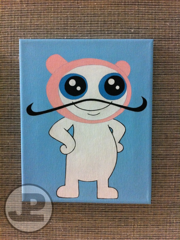
The second photo is of the boys’ alien friend Meap. Meap is an intergalactic security agent, and his mustache is actually a translator to help him speak different languages. Without it, he merely says, “meap.” He is precious, barfs rainbows of death, and is also painted with acrylics on an 8×10″ canvas.

And here are the two paintings together, as they hang in my cubicle.

If you aren’t familiar with this show, you should definitely check it out. It’s one of the most popular children’s shows on Disney Channel, if not across networks. It’s not so juvenile that adults can’t enjoy it and, quite frankly, grown-ups will laugh just as hard at the incorporated references and throwbacks between episodes. A friend turned me onto it, and I’ve become somewhat of a fanatic in the past couple of months. I anticipate many more paintings of these fun characters. (At the moment, they’ve even replaced Stitch as my muse… Never thought I’d see the day!)

What characters do you find inspiring?

Photos on Canvas

My apartment is pretty well-known (in my circles) for being colorful. I’ve never done well with white walls, so immediately upon moving in I picked the paint chips out for an aqua bedroom, teal living room, purple second bedroom and bath, and green kitchen. (That’s partially a lie, I had originally painted the kitchen a mango color that ended up doing nothing for me.)

And, while the walls aren’t white anymore, I still like piling on the color with my vast collection of wall art. Most of the pieces are my own (mainly paintings and photos), and others are from local shops and, of course, Etsy.

I love taking nature walks around my neighborhood when the flowers are in full bloom, snapping away with my camera, and some of the images are just downright dreamy. Somehow 4×6″ doesn’t do them justice. Then, voila. One of the coolest things I discovered was the ability to have your photos printed on giant canvases. I’m not sure who mentioned the idea originally, likely my sister, but I definitely took the idea and ran with it. (I’ve got at least 10 such prints of my photos hanging on my walls, and have given them as gifts as well!) This, and the introduction to the macro lens on my little point and shoot, have been sort of life changing. Make sure to change your camera settings so you capture the largest image size possible if you plan on enlarging a picture. (I use my camera’s M1 setting – 3264 x 2448 pixels. There’s a larger setting of 4000 x 3000, but I haven’t had any problem in scaling my pictures at the slightly smaller size, and the other’ll eat through your memory card much quicker.) These websites will warn you if your pictures don’t have enough resolution to enlarge without losing quality.

There are plenty of websites make these prints, and I’ve used a couple of different ones like Shutterfly and Snapfish, but I know CVS does them, and I recently bought a Groupon for a company called Image Canvas, so I’ll be testing them out. You certainly don’t have to use a different company every time, but I generally wait to print anything on this scale until I get an offer for a good sale price, and they can come from a variety of sites. (I recommend waiting on sales for 40% off or upwards, these can run expensive!) The reason I branched out to different sites was because Shutterfly and Snapfish each offer different sized canvases. I ended up getting my larger prints from Shutterfly and my smallest three from Snapfish. The one disappointment I had with Snapfish was that their photos arrived and the canvas was matted, not glossy. To remedy, I just applied my own clear coat of varnish (something I’d use on top of an acrylic painting) to make it shinier, and it didn’t affect the image in anyway.

This first image is one of my favorites. You might find it surprising, but bees are some of my favorite subjects, and the most photogenic. (I even gave my mom a couple prints from my “bee butt” series.) The flowers are kind of interesting too 😉 This print is 24 x 36″ on canvas, and below is the original photograph. (The colors in the print are pretty true to the original, they’re just not translating in my picture of a picture.)

These three prints are each 8 x 10″, and their progressing shades of orange against the teal wall (looks more blue here) make me smile.

Hopefully this inspires you to create some of your own wall art. It’s not just for the pros anymore!

Studio City Arts and Crafts Show

Hello Angelinos!

If you’re in the Studio City area, and are looking for something to do with Mama this weekend, be sure to check out the Rotary Arts and Crafts Show over at Laurel Canyon and Moorpark. You can count on being inspired and interacting with tons of great vendors – I met many of them a few weeks ago at the Woodland Hills Crafts Show – and it’s also a fundraising event!

The event runs both Saturday the 12th and Sunday the 13th from 10am-5pm. On Sunday, you can even stroll on up to the Studio City Farmer’s Market afterwards to stock up on some fresh produce to match your new artwork.

Parking is a pain, I won’t lie to you, but if you get there earlier on you’ll find spots closer by. Weather and all, this promises to be a great weekend for being and about in LA. I’m looking forward to going on Sunday myself, and regardless of whether you can make it or not, I hope you and yours have a lovely Mother’s Day!

Glitter Nail Polish – How To

So here’s a little how-to follow up to my last post about glitter nail polish. I happened to find those fabulous colors in a retail store, however I haven’t always been able to find just the right shade.

There is a nail salon nearby that I used to frequent and, if memory serves, it [probably still] has the greatest selection of colors I’ve ever seen. Since I can’t always splurge on a mani-pedi just to get the color I want – and I also actually enjoy painting my own nails – I inquired about purchasing my favorite polishes for home. Unfortunately, they didn’t sell all the colors they stocked in the shop. However, one of the girls who worked there suggested I might make my own.

Surprisingly, it was something I’d never considered. When she recommended using extra fine body glitter, which can be found at a beauty supply store if not in a drug store, it was truly a, “like, duh!” moment. I bought 2 shades of glitter – Hollywood Lights from Cinema Secrets, to be precise – and 2 cheapo bottles of clear polish. In hindsight, as with most polish, the somewhat pricier ones are usually worth a bit more. Just a bit!

Use a rolled piece of paper, or something similar, to help funnel the glitter into the bottle of clear polish. There’s no exact proportion for this, I made sure to use quite a bit because I wanted good coverage. (I hate sparse glitter polish that requires 2 coats just to notice it!) Keep in mind, as with all glitter projects, that this has the potential to get super messy, so put some paper down in case of spills.

That’s it. Just pour glitter into your polish and stir. This could depend on the polish, but I know the glitter in mine tends to settle at the bottom, so you’ll have to make sure to mix it well before using. I wonder if a thicker polish helps suspend the glitter better. I imagine it does, since my store-bought ones don’t have this problem.

So let this be a lesson to you as it was to me- whether with nail polish, or almost anything else, if you can’t buy what you’re looking for, try to make it yourself!

Glittery Nails Make Everything Better

Fact.

It’s been pretty dreary here in LA for the past few days, and the chill and drizzle are quite an odd converse to the 90ºF we hit on Friday. But as gloomy as it may be outside, I’ve been livening things up with my new nail polish!

I’ve considered myself an experienced nail painter since at least the 7th grade. In fact, I remember challenging myself at one point and painting my nails a different color and/or pattern every day for 2 months straight. These days I just hope that my polish makes it through more than a day without chipping so I don’t have to redo them. Don’t get me wrong, I love painting my nails, but all my free time lately is just before bed, and fresh polish + sheets + I swim in my sleep = disaster.

Anyways, this green is not being properly represented in these pictures, and I don’t have the wherewithal to color correct them now that Picnik no longer exists, but they are a brilliant shade of emerald. Think Wizard of Oz, or a box of Thin Mints. The color in the pictures is pretty, but not nearly as vibrant as it looks in person. Boo to that.
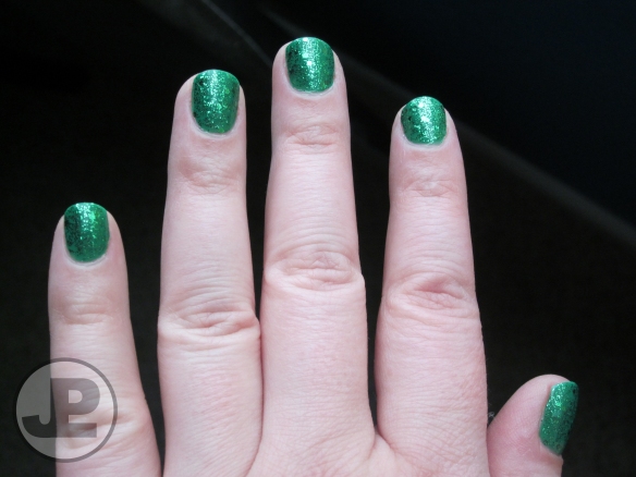
So I picked these new colors at Forever 21 over the weekend. (It was weird for me too, those bins by the checkout stands are so dangerous.) When I was a polish novice, I used to think that a couple of coats of glitter shellac were enough to convey a color on their own. Then at some point, when I was older and wiser, I realized that by pairing a glitter polish top coat with a base coat of a solid in a similar hue, the sparkle and color impact would be tenfold. Take my toes for example, in real life they look like the finish on a bowling ball. Epic. (I purchased those colors at Forever 21 as well. They have a solid summer palette! You’ll notice that the teal glitter is finer than the green, and I actually prefer that aesthetically – even though my nails are totally kickass!)

According to the Forever 21 website, the base coat on my fingers is Go Go Green, and the glitter is, cleverly enough, called Green Glitter. For my toes, I used a base of Cobalt Blue, and topped it off with Blue Glitter. (In real life, the labels on both the blue bottles say “blue,” and the green say “green.”)

Having never used it before, here is my review of the polish. The one downfall of this particular brand seems to be that is that it’s super matted, including the glitter, so to get a any shine you’ll need to use a clear top coat. Besides that, I did 2 coats of the solid green, and 2 coats of the glitter. The opaque color coated just fine in one, but I wasn’t sure how the glitter would distribute since it’s not fine, so I wanted to make sure everything was covered. You don’t have to do as many, I get carried away. On the major plus side – surprising with what I thought would be a very cheap polish, and despite the fact that there are so many layers – they still haven’t chipped, and it’s been over 3 days! (knock on wood.)

So there you have it. If the gloom has got you down, shake up your regular nail routine and pair your matte colors with a cop coat of matching glitter. Now you too can spend your dreary days like I do – grinning stupidly at my nails every time they catch my eye.